Tuesday, July 31, 2012

Splashin' Some Color

I've been trying to revamp my blog the past couple days. It's like expecting a car to be able to sing and dance. Or like thinking you can teach a cat to quote Shakespeare on a motorboat on the Nile. Not good. I got so frustrated, and wasted so many tiles, I decided to stop and play. You can see above what I made in about 5-10 minutes.
I made two tiles before I thought to photograph them. Before I started painting, I put my craft sheet on my desktop. I got mine at Michael's for about $3.00 on sale. An Inksentials Craft Sheet. That's the brown tweed looking sheet you see above. It's plastic and wipes clean (pretty much) with a baby wipe afterwards.
For the tiles above, and the ones in this set, I used Adirondack Color Wash that Tim Holtz uses. I started by washing a good layer of clear, clean water on the tile. Then I used butterscotch color wash - spritzing it on the right hand side of the tile. Then I spritzed some sunset orange on the left. I learned that I need to test this out before I blast a heavy shot on my tile - like you see above. All that came from one push of the button. 
I blotted some of the color away with a paper towel, then added some purple twilight and wild plum on top of what was left behind. Because of the amount of water still on the tile, the colors will run and bleed together giving you the pretty colors you see above.
Definitely more color than I need since I want to tangle some designs on these tiles. So I should have remembered what I wanted to use the tiles for before I got trigger-happy with my color wash :), but never fear - this tile will go great on an art journal page!
For this tile, I used the color wash sprays in a different way. I left the tile dry, and spritzed some color wash all around the tile. I used at least four colors and a light hand. Then I took my wet paint brush and dropped some splotches of water on various parts of the tile, allowing the paint to run.
I had a little bit too much water here . . . 
. . . so I wicked away the big blotches by lightly touching them with the paper towel. (Just so you know, I get my nails done at Davi Nails at Wal-Mart.)
And this is what I ended up with. Probably another art journal entry :).
For this tile, I dropped bits of water here and there on the tile, then sprayed on some cherry blossom walnut ink spray by Tsukinek, as well as some lilac. I thought it was entirely too dark, so I . . . 
. . . blotted it with yet another paper towel. This time I placed the paper towel right down on top of the entire tile - which picks up excess color, but also leaves a cool textured design in the remaining color.
Those of you who know me, know that I am all about the color. At times (like now) I actually have this shade of pink mixed in with my brown and blonde hair. To get this color on the tile, I sprayed some raspberry Inkadinkado spray ink right on top of the tile you see above it. 


(An aside note here - I do not like the Inkadinkado spray inks! It is next to impossible to control the amount of ink that comes out, and when you press the spray button - ink shoots out onto your fingers. This has happened with every bottle of Inkadinkado spray ink that I have tried. I was hoping this one time it wouldn't happen. Oh well. )
I dripped a little water on top of the color and pushed the color around a bit with my heat gun. Works pretty well for pushing, and you get some nice colors as it dries.
I wanted it to have some contrasting color, so I took a few swipes across the tile with a broken china Tim Holtz distress stain.
I just noticed I have the wrong bottle of color showing with this tile. Oops!
Speaking of Tim Holtz distress stain - new tile! You can see that I just splashed some drops of water onto the paper. I didn't want full coverage. I wanted to see what would happen with just a few drops. Then I used the dried marigold stain and just tapped it onto the tile in a couple places. I was surprised by how much color came out and by the intensity. I like it!
So I added some more colors - spun sugar (my favorite), dusty concord, and broken china (the blue) - staying with the tapping.
There was too much water, so I blotted the whole thing with a paper towel. Then it was too light.
But my paper towel looked awesome!
The only thing I did was to tap back on a little orange (dried marigold) and I was done with this tile.
So there you have it. The 5-minute-Alice-Hendon-teaches-a-cat to quote Shakespeare on a motorboat on the Nile technique. I hope you enjoyed it! You just learned how to do it right along with me, cause there's a first time for everything :).

Monday, July 30, 2012

String Whimsy

TanglePattern.com has given us another string for the week. This one comes from Yamit Fridman from Israel. I really love how people all over the globe are embracing zentangle. I talk quite a bit with a couple ladies from Holland, and I visit quite a few blogs written in dutch, so I have added a translate function to my blog. 


Anyway, back to this post, a couple nights ago I posted a watercolored tile I had made. Well, this is it, even though the shape has changed a little. I had a slight accident along the right-hand side (actually kind of major) so I chopped that side off and kept this part :). Here is the string we started with:
I finished up with what you see above. A little watercolor, a bit of BTL Joos, a whole bunch of circles, and finished off with some Spica pens. You can check it out at www.tanglepatterns.com.


A big thank you!!! to Vanessa at LBG Studio, who is being so wonderful in answering some questions I have about photos. Thank you, Vanessa! Please check out her awesome blog here :).

Saturday, July 28, 2012

Oodles of Flowers

Photobucket The Bright Owl
It's time for the Zendala Dare #16! Here was this week's template: Photobucket
Each week, Erin gives us a blank mandala template for us to work the magic of zentangle on. We tangle any patterns we want to use, then we share them on her page The Bright Owl for all to see.
Photobucket
I actually drew two tiles this week. I need to practice my line work, so this was my first effort. My straight lines are alright, but I really have problems with round lines. I'll keep working on it.
Photobucket
This one I am little bit happier with. This shot will give you a little perspective of the size paper I'm working with.
Photobucket
I began by watercoloring a couple tiles. I usually do at least two in case I mess one up somehow. Doesn't usually happen, but sometimes it does. Once I decided I wanted to draw flowers, I chose the pinkish tile over the blue. Pink reminded me more of flowers, the blue more of water. I traced the template onto my tile lightly with a pencil, then started adding in lines with my micron.
Photobucket
I just kept filling in spaces. I didn't start out planning on doing flowers only, but it just seemed right as I went along. Then I started filling in spaces with the black micron.
 Photobucket 
And - - - my finished tile. I stood there and stared at those four open pink spaces. I thought about filling them in with leaves, and then thought, no. Less is better. It doesn't hurt to leave some open spaces. To check out everyone's zendala work, head on over to The Bright Owl hereThere's plenty of time for you to work on one yourself and join us!

Friday, July 27, 2012

Mi2 - The Diva's Challenge #80

iamthedivaczt Photobucket
I Am the Diva - I love this lady's blog! She is a wife, and a mom of two very active little guys. She is a certified trainer for Zentangle, and she gives and gives from her heart to the Zentangle community. Laura, you are an inspiration to me! Thank you for all the work you do for us!


This week's challenge was to use the pattern Mi2 - that's the one you see waving across the bottom half of my tile above. Gotta say I wasn't excited about this challenge. I've tried Mi2 before - those tiles are long since visiting the county dump. But, I stuck with it this time - I mean, Laura asked us so nicely - and the above pic is what I came up with. I am satisfied with the way Mi2 turned out, although I won't be rushing myself to check it out again any time soon. Hahaha! Also included in the tile are pokeleaf, pokeroot, fescu, and beadlines. You can see everyone's Mi2 offerings at Laura's page here. You could even draw one yourself and show it us :). I would love to see it!

Thursday, July 26, 2012

Catch Up Time, Zendala Dare #14

The Bright Owl
Photobucket
Not sure why, but my life has been a little hectic lately. Last week I was busy building a new facebook page The Creator's Leaf and working on this blog - trying to make it more professional. Crazy times! Cause I sure don't know what I'm doing. Anyway, I missed last week's Zendala Dare :(. Above is the template Erin gave us to work with.
Photobucket
I found this template a real challenge. As I was staring at it last night - trying to think, "what circular patterns do I know?" and it dawned on me that this could be one big gear! Yay! Steampunk! So this is what I did with Erin's template. Lots of fun! I started with the center gear, then expanded the metal arms along the sides of the smaller circles in the template. The large circles at the top made up a bunch of screws and fittings. Add in some pipes and a wall in the background, then liberally wash some watercolors around. Ta-da!

Patterns are pretty much ones I made up: geerz, barz, pipez, and a wall :). Color from Derwent Inktense Pencils, a Pitt Artist Marker, and  Pentel Slicci pen. Check out all the zendalas that were done on time at The Bright Owl.

Wednesday, July 25, 2012

It's All About the Swirls! IA Challenge


Inspiration Avenue Challenge Link
Photobucket
This is the first week I've participated in the challenge at Inspiration Avenue. This week's theme is swirls, so I had fun tangling a bunch of swirly patterns - swirling! I drew this in my mini smash journal, then colored portions with my Pitt Artist Markers. Patterns include wavy border, portholes, swirls, printemps, river, and a variation of nipa. To check out all the swirls, visit Inspiration Avenue. Perhaps you 'd like to post a piece of your own artwork!

Ink, Pens, Paper - APR #19


just add water silly's blog hop link
Photobucket
Lots of fun things happening in the Artist's Play Room this week where Jenn has challenged us to pick up the theme of ink, pens, and paper. I've thought and thought about what I could do. I could do some tangled tiles, but I do those every day. I was editing some wedding shots today and thought about the scripture photos I make. Prints definitely consist of paper and ink, and the editing uses a digital pen of sorts. So here you go - one of the endeavors I love the most in my photography - scripture photos. 
Photobucket
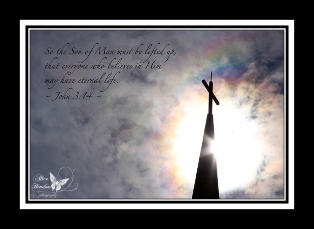
These are all photos I took at various locations across the United States. I love matching God's creation with God's Word.
Photobucket
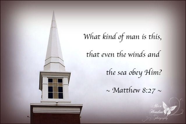
We are told in the scripture that His word never returns void - that it always accomplishes His purpose.
Photobucket
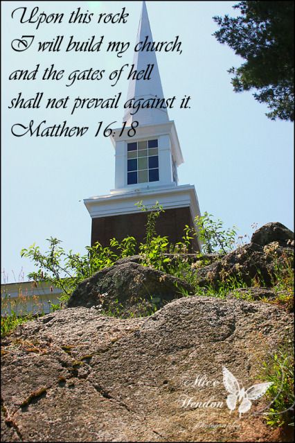
I hope to one day publish a book including my scripture photos, as well as my series of cross and steeple shots I've taken as Kali and I traveled the country. Another speech and debate tournament meant another set of churches, steeples, and crosses to be photographed :).
Photobucket
God's creation - it's wondrous. It's majestic.
Photobucket
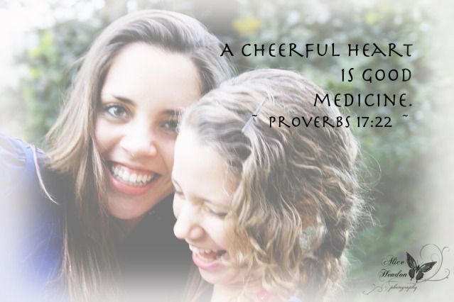
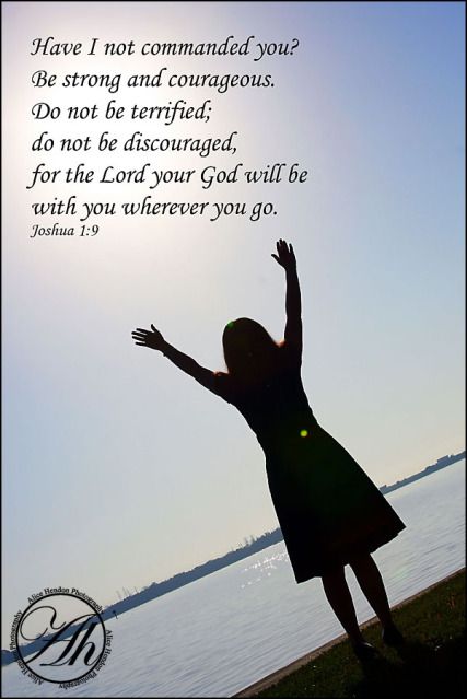
A bonus to our travels is that I have friends in many states - and I shoot a lot of senior photos. I always ask the student to tell me what their favorite verse is. Maybe a life scripture they try to live by. Then I match those verses up with one of our shots and make an awesome photo that their parents (or the student) can be proud of.
Photobucket
It's gotten to be a signature shot of mine, along with shoe shots, and pics of people in trees - haha!
Photobucket
The students (and parents, too) pretty much know that if I am doing their photos, I need a scripture, some awesome shoes, and someone is going to end up in a tree!
Photobucket
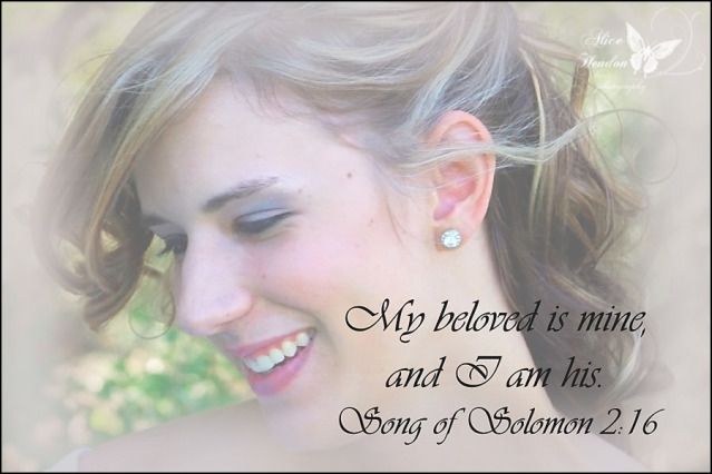
Same thing with weddings . . .
Photobucket
. . . garden shots, . . . 
Photobucket
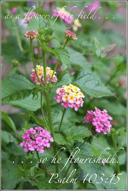
. . . and family photos! I find that there is always a verse to go with any given circumstance. We just have to keep receptive hearts to hear it.


To check out all the other interpretations of ink, pen, and paper, please visit the Artist's Play Room here. You could even join in!